Wavelength
Redesigning the hearing health experience — from discovery to daily support — for people navigating hearing difference.
The Problem
Music is one of the most universal human experiences, yet for deaf and hard of hearing listeners it has always been partially inaccessible. Lyrics are missing from entire albums with no explanation. When lyrics do exist they highlight one line at a time, making it impossible to follow which specific word is being sung. There is no visual expression of volume, rhythm, or emotional dynamics. Accessibility settings are buried in system menus rather than built into the app itself. And the one sensory connection that is genuinely available to deaf listeners — feeling bass vibration through a phone — has never been intentionally designed. It is an accident, not a feature.
Wavelength is a fictional music app designed to show what music accessibility looks like when deaf and hard of hearing users are treated as the primary audience rather than an afterthought.
Research
I drew on my own lived experience as a deaf user as the primary research source, combined with extensive community and academic research. Secondary research included:
- Community research from r/deaf and r/hardofhearing documenting real user frustrations with music apps
- Asphyxia's YouTube video on deaf music experience reviewed in full transcript
- Spotify community forum threads documenting missing lyrics complaints
- Three academic papers covering deaf music experience, captioning design, and accessibility in streaming platforms
- Competitive analysis of Amplio and Moises, both of which have accidental rather than intentional accessibility features
Spotify lyrics view showing line by line highlighting — no word by word precision for deaf or hard of hearing listeners.
Spotify album page showing songs with no lyrics available — no explanation, no request option, and no path forward.
Key Insights
- Deaf users are not passive listeners. They actively seek music experiences and feel the exclusion acutely when apps fail them
- Line by line lyric highlighting is not enough. Word by word precision is the minimum standard for a genuinely accessible experience
- Missing lyrics are not a minor inconvenience. They break the shared social experience of listening to music with friends
- The phone vibrates naturally with bass. No app has ever treated this as a designed feature rather than a side effect
- Accessibility mode should be one tap from the home screen, not buried three menus deep in system settings
- Captions and lyrics are perceived as a deaf feature but research shows they benefit hearing users too
Design Process
I mapped the current state experience of a deaf music listener across eight journey stages, from discovering music through to feeling it physically. The most revealing insight from the journey map was that the moment of exclusion is not discovering a song has no lyrics. It is being sent an album by a hearing friend, opening it, and finding half the songs inaccessible with no explanation and no path forward. That specific moment of social exclusion shaped the shared listening mode screen and the missing lyrics request flow.
Solution
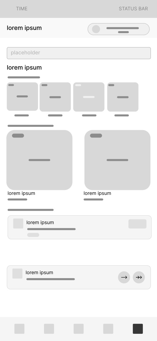
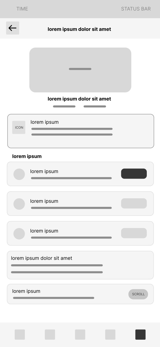
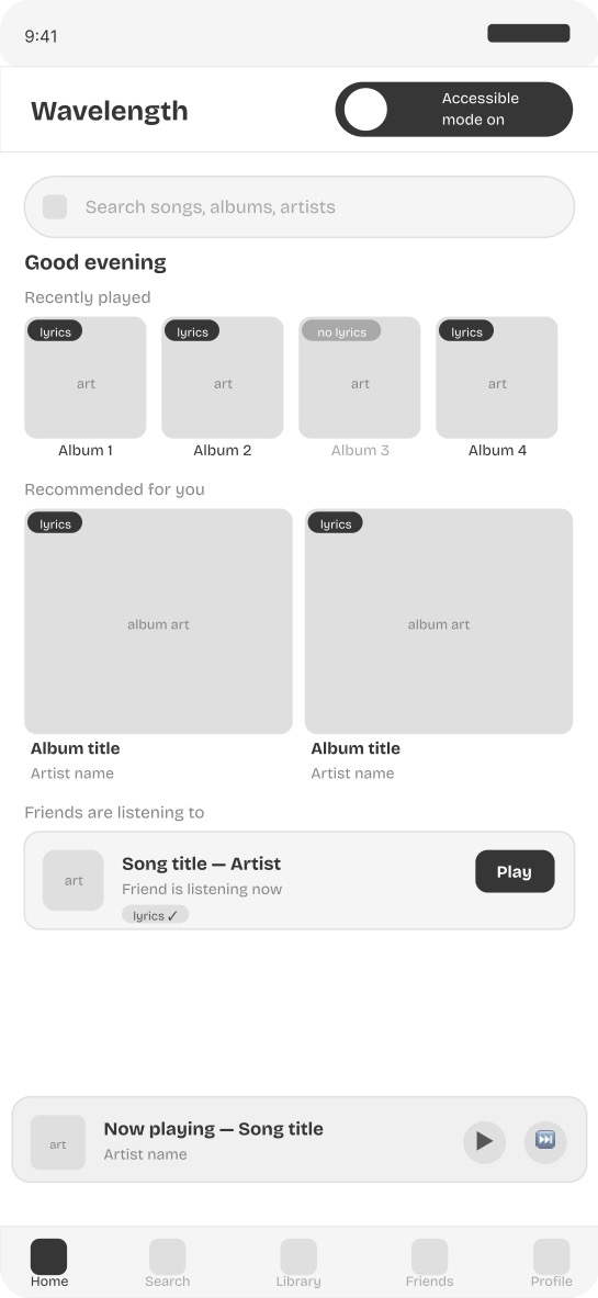
Screen 1 — Home screen with accessibility mode toggle A visible accessibility symbol on the home screen activates full deaf friendly mode in one tap. Every album card shows lyrics availability before the user commits to listening.
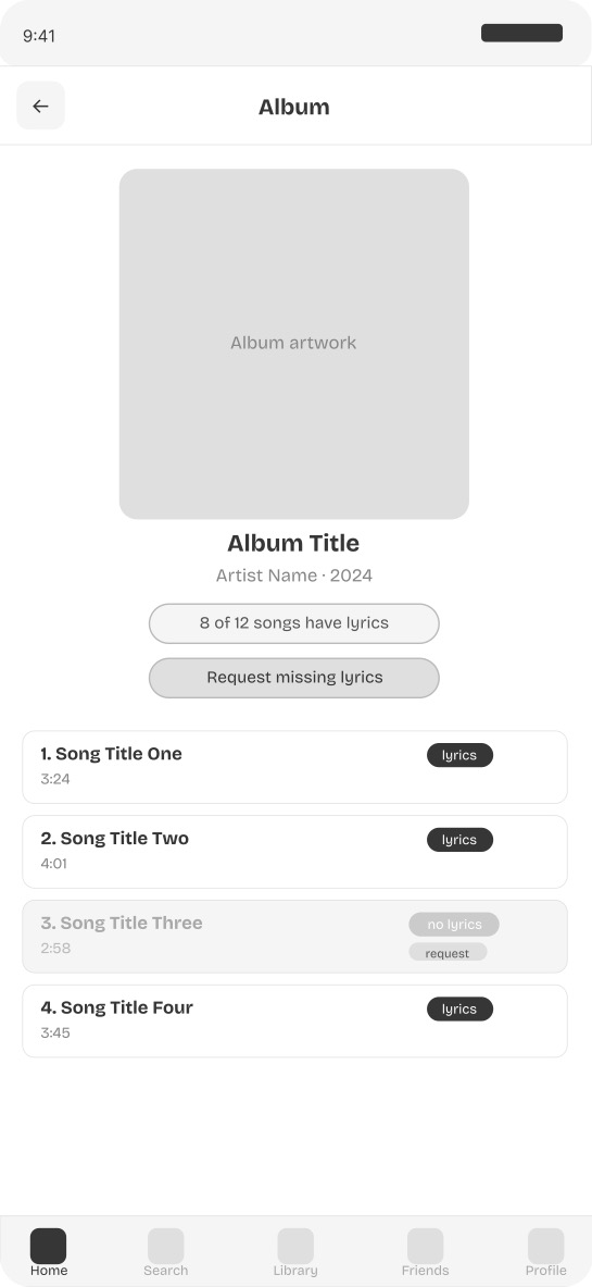
Screen 2 — Album page with lyrics availability badges A lyrics completeness indicator shows how many songs on an album have lyrics before the user plays a single track. Songs without lyrics are visually distinct and include a request option inline.
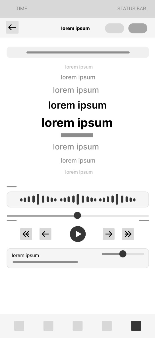
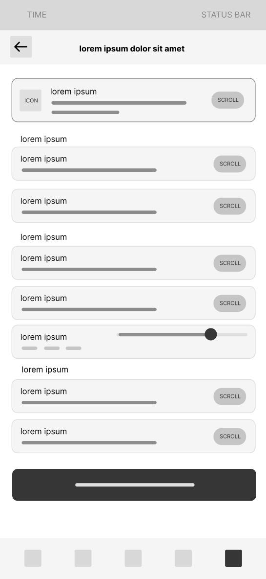
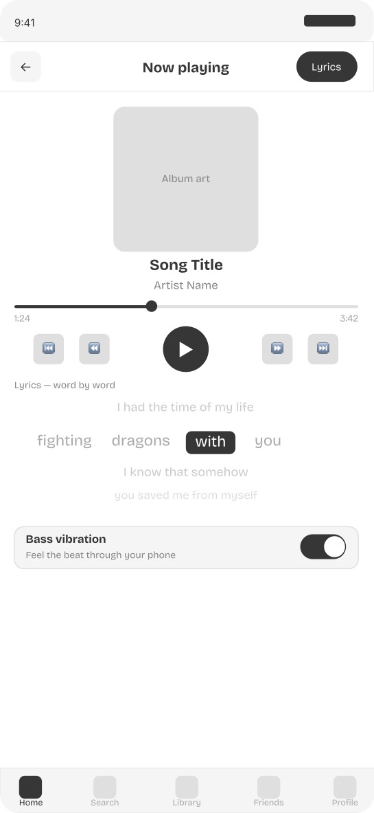
Screen 3 — Now playing with word by word lyrics Each word is highlighted individually in real time as it is sung. Previous lines fade above and upcoming lines appear below. Bass vibration is toggled directly from the now playing screen.
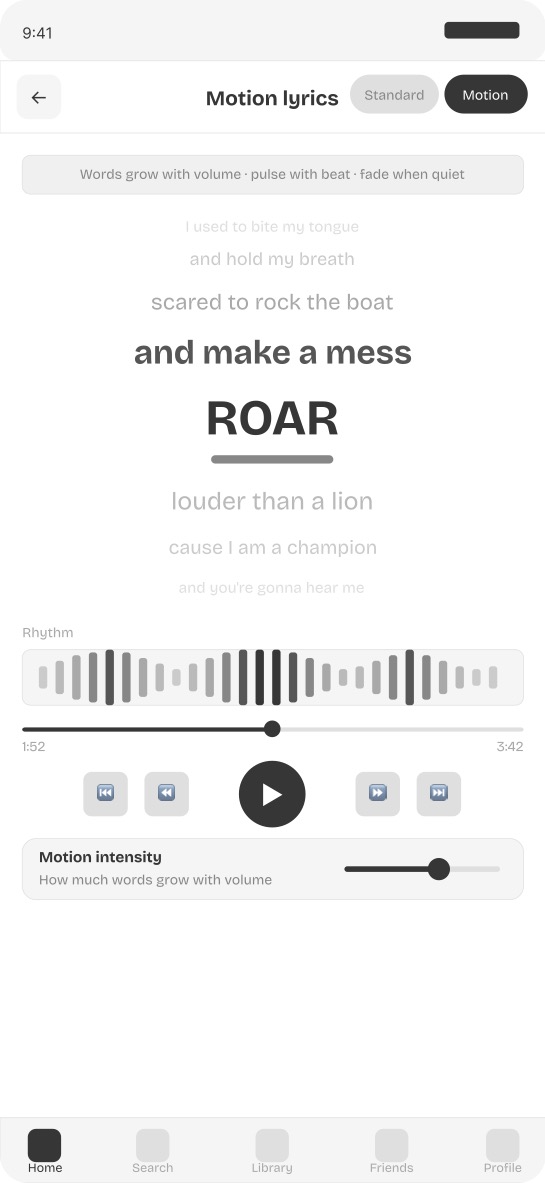
Screen 4 — Motion responsive lyrics view Words grow with volume and pulse with beat. The current word is the largest and darkest element on screen. A visual rhythm waveform shows the beat independently of the lyrics.
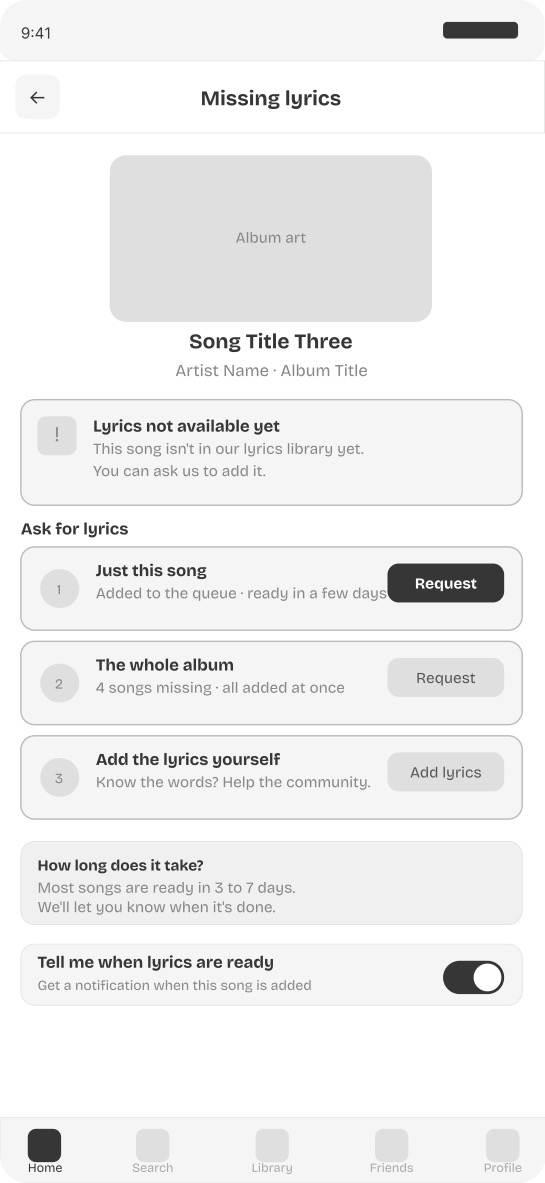
Screen 5 — Missing lyrics request flow Three options are available when lyrics are missing: request this song only, request the entire album at once, or contribute lyrics directly. An estimated timeline and a notify me toggle ensure the user is not left at a dead end.
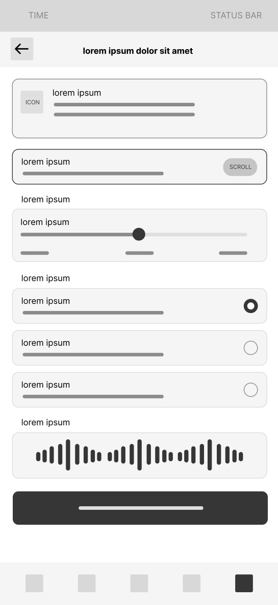
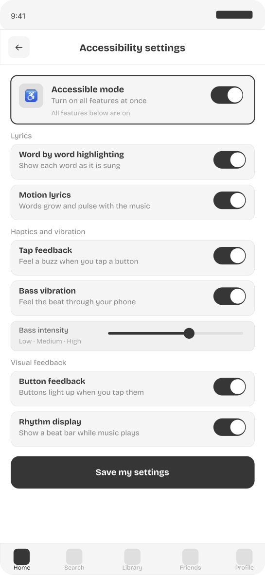
Screen 6 — Accessibility settings panel All accessibility controls are centralized in one panel accessible from the home screen. A master toggle activates everything at once. Individual controls for word by word highlighting, motion lyrics, bass vibration, tap haptics, and visual feedback can each be adjusted separately.
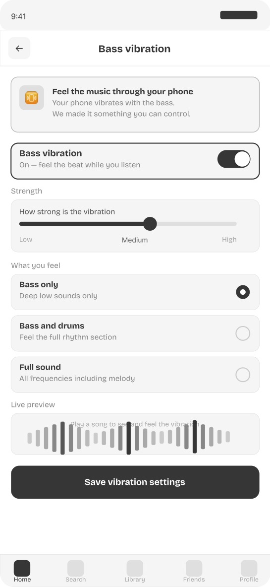
Screen 7 — Bass vibration controls Bass vibration is treated as an intentional designed feature rather than an accidental side effect. Users control intensity from low to high and choose their preferred frequency range. A live waveform preview shows the rhythm visually while the phone vibrates in real time.
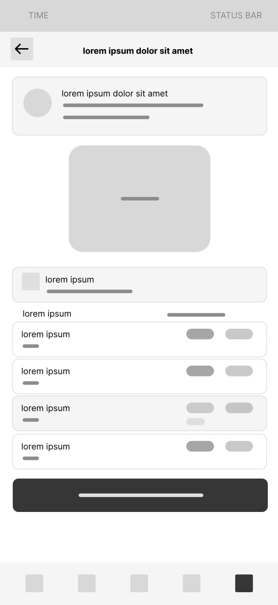
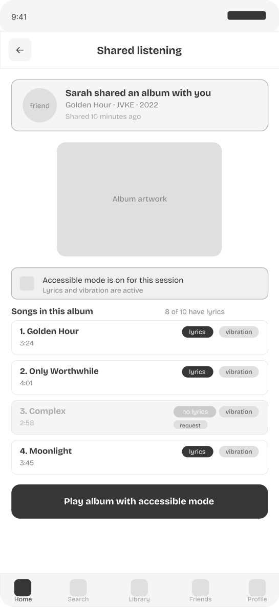
Screen 8 — Shared listening mode When a friend shares an album, the shared listening screen shows accessibility status per song before anything plays. Songs with lyrics show both lyrics and vibration availability. Songs without lyrics show a request option inline. The gap between deaf and hearing listening experiences is made visible and actionable rather than invisible and frustrating.
Lo-Fi Wireframes
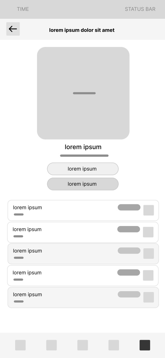
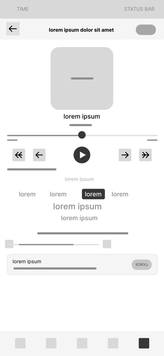
Mid-Fi Wireframes
Prototype
Best viewed on desktop. On mobile you can pinch to zoom inside the prototype.
Outcome & Reflection
Wavelength demonstrates that music accessibility is not about adding a features tab. It requires rethinking the entire listening experience from the perspective of someone who cannot hear. Every screen in Wavelength exists because a specific documented research finding identified a specific gap.
The most unexpected design challenge was the missing lyrics screen. The instinct was to simply show an error state. The research showed that the real problem is not the missing lyrics themselves but the feeling of being left out of a shared experience with no recourse. Reframing the screen as an empowerment tool rather than an error state changed everything about how it was designed.
If I were to continue developing Wavelength I would conduct usability testing with deaf and hard of hearing participants specifically on the word by word lyrics screen and the bass vibration controls, and use Microsoft Clarity to track engagement with the accessibility mode toggle on the home screen.