Cove
Making personal security legible — a tool that transforms breach data into clear, actionable protection for everyday users.
The Problem
Most people discover they have been breached by accident. When companies do send notifications they arrive as legal documents with no plain language, no prioritized next step, and no empathy for the person receiving them. Meanwhile the tools that could protect users — strong passwords, two-factor authentication, breach monitoring — are buried in settings and almost never introduced during onboarding. Security is treated as an afterthought rather than a core product experience.
Research
I conducted primary research through my own security setup journey, discovering compromised accounts via haveibeenpwned, configuring 1Password, and analyzing network traffic with Proxyman. Secondary research included:
- Reddit threads from r/privacy documenting real user breach experiences
- PayPal and Navia breach notification articles analyzed for plain language failures
- Verizon DBIR 2025 and IBM Cost of a Data Breach 2025
- Academic papers on 2FA usability and password manager onboarding
- Competitive analysis of Amazon, Target, and ASOS, all of which share the same core failures
haveibeenpwned.com showing multiple compromised accounts with no prioritization and no guidance on what to do next.
Key Insights
- Users do not fail at security because they do not care. They fail because security UX is designed to be ignored
- Breach notifications are written for legal compliance, not for the person receiving them
- 2FA is buried, inconsistently labeled, and almost never introduced during onboarding
- MFA fatigue is a direct result of push notifications that provide no context. Users approve suspicious logins just to make the alerts stop
- Security shame is a design failure, not a user failure
Design Process
I mapped the current state experience of a non-technical retail shopper across eight journey stages, from account creation through breach discovery and recovery. The most painful moment was not the breach itself but the moment the user realizes they have no idea what to do next and no one is helping them. That insight directly shaped every screen in the solution.
Solution
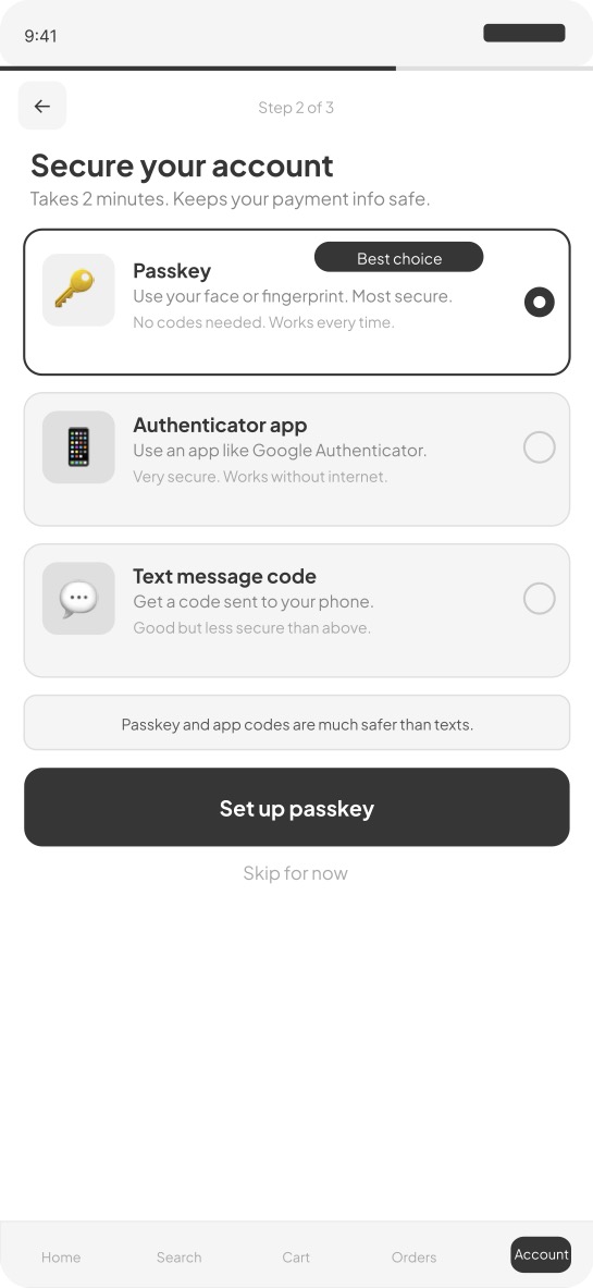
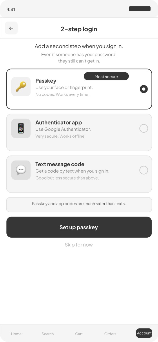
Screen 1 — Onboarding security setup 2FA is introduced as step two of three during account creation, not buried in settings. Each option is explained in plain language with a recommended badge on the most secure choice.
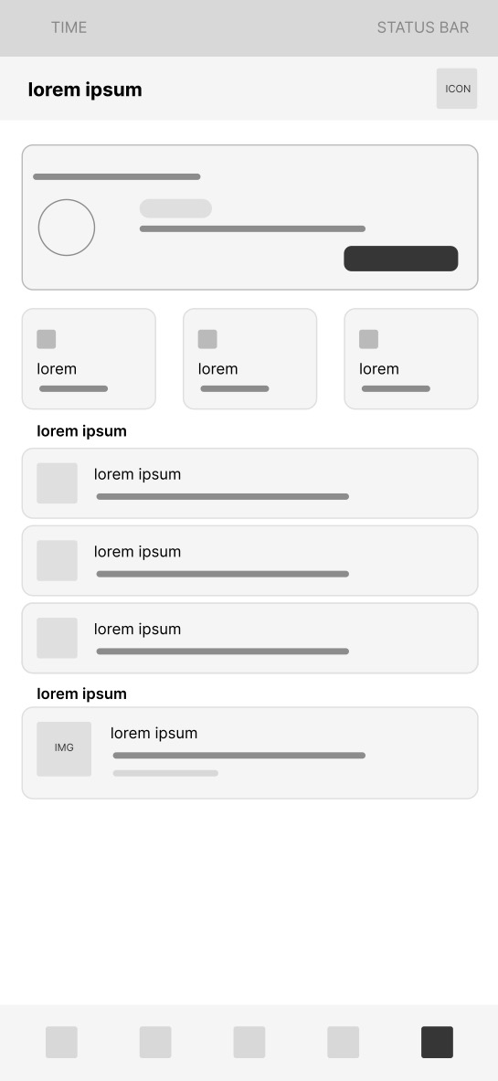
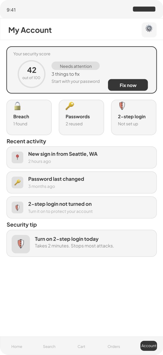
Screen 2 — Account home security score A security health score from zero to one hundred is visible every time the user opens their account. Three status cards show breach status, password health, and 2FA status at a glance.
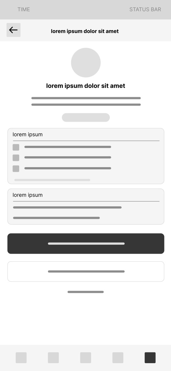
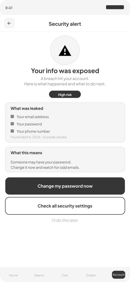
Screen 3 — Breach notification Plain language replaces legal boilerplate. The notification names exactly what was exposed, explains what it means in one sentence, and offers two clear prioritized actions.
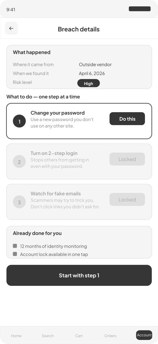
Screen 4 — Breach detail Recovery is presented as a numbered sequence, one step at a time. Steps two and three are locked until step one is complete, preventing overwhelm.
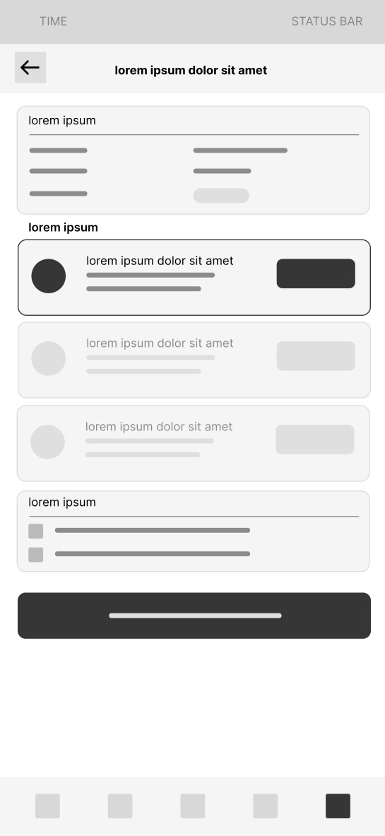
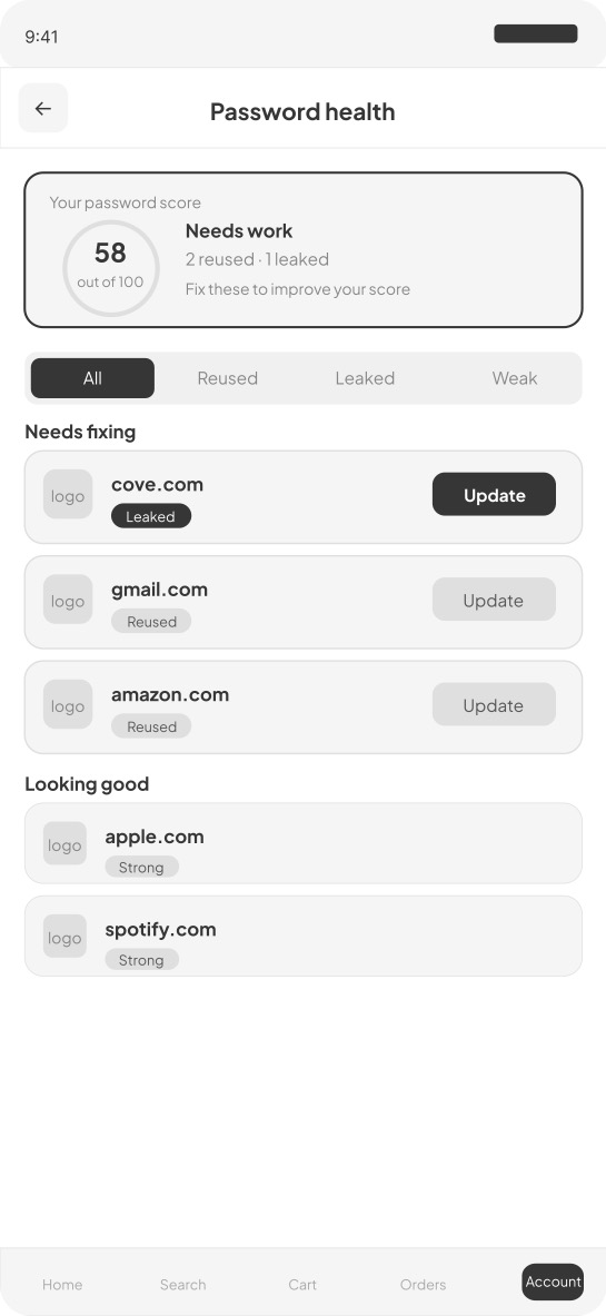
Screen 5 — Password health Reused and compromised passwords are surfaced with an overall health score and update buttons prioritized by severity. The compromised password always appears first.
Screen 6 — 2FA setup Three options with plain language explanations and a clear recommendation. One tap to set up the recommended choice.
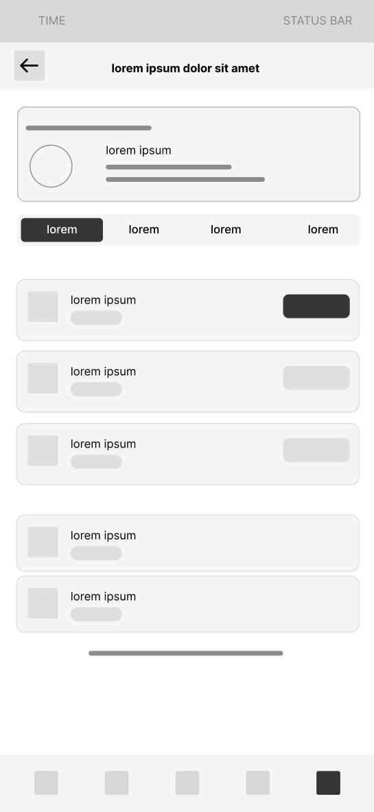
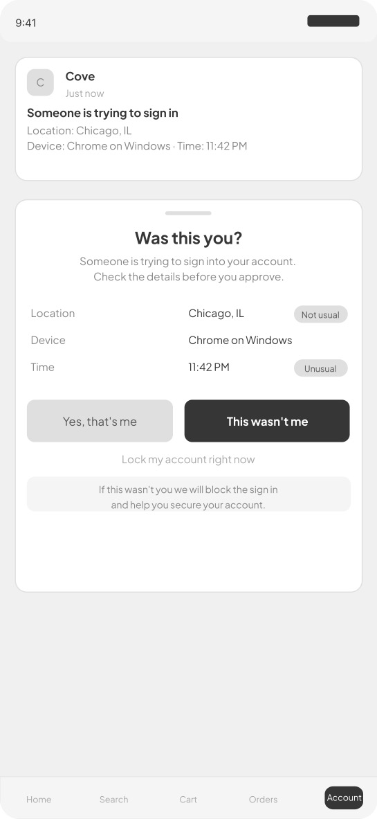
Screen 7 — 2FA notification Full context is shown including location, device, time, and IP address, with equal visual weight on approve and deny. This directly solves MFA fatigue.
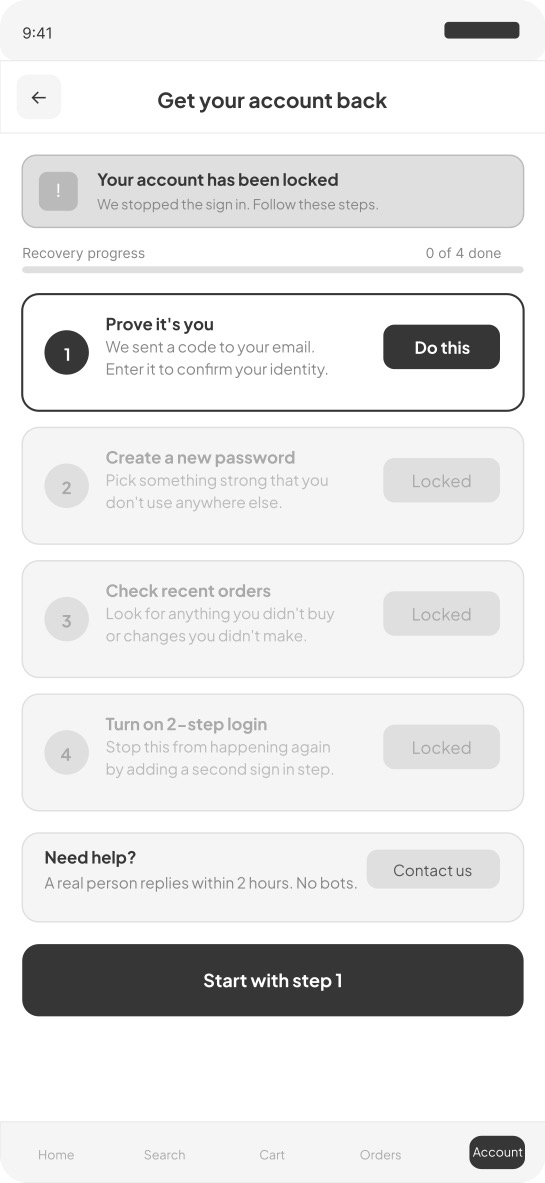
Screen 8 — Account recovery A four step guided recovery process where only the current step is active. A human support card promises a real person within two hours.
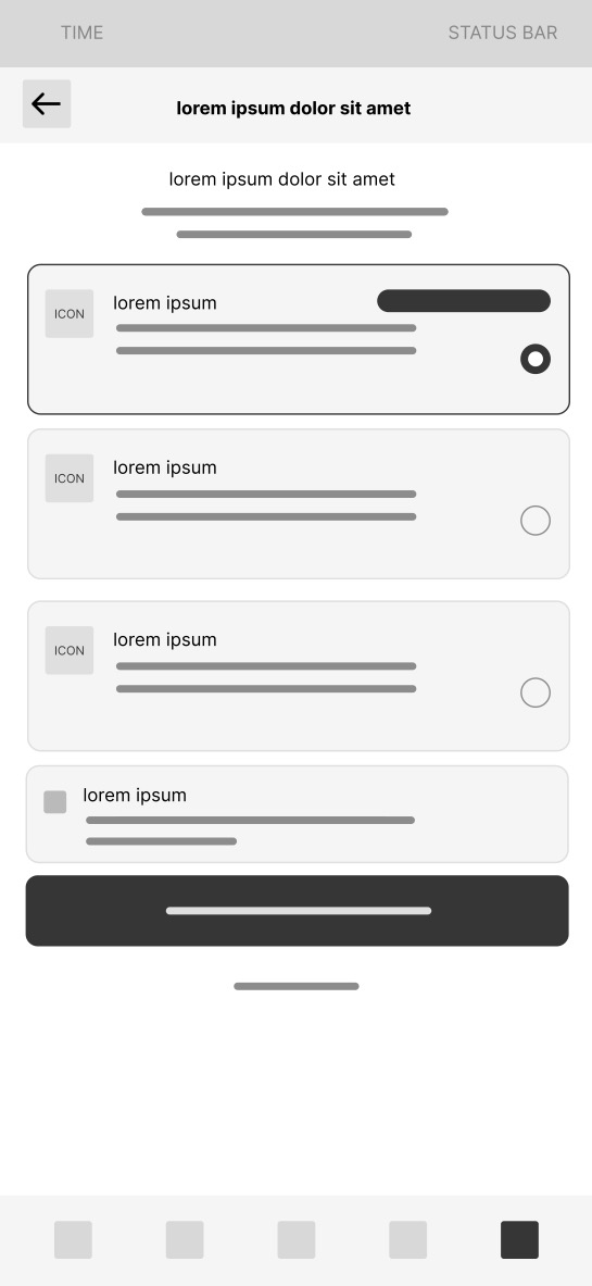
Lo-Fi Wireframes
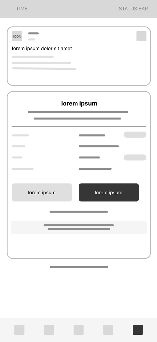
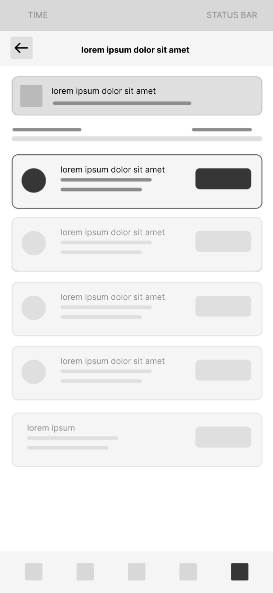
Mid-Fi Wireframes
Prototype
Best viewed on desktop. On mobile you can pinch to zoom inside the prototype.
Outcome & Reflection
Cove demonstrates that security UX is a design problem, not a technical one. Plain language, visible security health, and 2FA introduced during onboarding are not engineering challenges. They are design decisions that most products simply have not made.
If I were to continue developing Cove I would test the onboarding security setup screen with non-technical users to measure 2FA completion rates and use Microsoft Clarity to identify drop-off points in the breach recovery flow.